
代码:
var s = "screen width x height: " + window.screen.width + " x " + window.screen.height;
s += "\r\n";
s += "documentElement width x height: " + document.documentElement.clientWidth + " x " + document.documentElement.clientHeight;

alert(s);
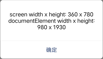
在某手机中效果如下:
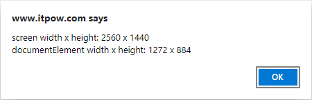
在 Chrome 电脑中效果如下:
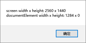
在 Firefox 电脑中效果如下:
可以看出:
screen 宽度和高度:
手机中是浏览器分辨率,而不是屏幕分辨率。
电脑中是显示器分辨率。
documentElement 宽度和高度:
都是指内容的宽度和高度,不过在手机里,不做分辨率折算了。
关于高度,可以看到 Chrome 与 Firefox 不同。这到底是指可视区域的高度,还是内容高度呢,如何让 Firefox 向 Chrome 靠拢呢?指定 <!DOCTYPE html>,此时在 Firefox 中,也有高度了。
在线测试:

